A client recently said something to me that reframed the whole challenge of selling jewellery online. They’d spent years working with customers at the highest end of luxury retail, and their observation was simple: by the time a customer walks into a store today, they’ve already done their research. They know roughly what they want. What they’re looking for at that moment isn’t more information. They need to feel it.
That’s a different bar to clear than just showing something accurately. An accurate render answers the question “what does this look like?” A render that earns a feeling has to answer something closer to “could I see myself wearing this?” Those are not the same question, and they don’t necessarily have the same answer.
I started thinking about what it would actually take to build something that clears that second bar. Not just technically correct, but close enough to real that a customer looking at it could start to want it. What I found, working through it, is that almost everything you’d reach for instinctively when trying to make something look real works against you when the subject is jewellery. The usual fixes made things worse. The usual shortcuts were visible. Getting it right turned out to require unlearning a few things first, and that process is what this article is actually about.
Light Is the Entire Game
The single biggest difference between a render that reads as real and one that reads as “a picture of a 3D object” has nothing to do with the geometry, the materials, or how much detail went into the model. It’s the light.
This sounds obvious until you try to fix it, because the instinct when lighting a 3D scene is to add lights. A key light here, a fill light there, maybe a rim light to separate the piece from the background. The result looks lit, but it doesn’t look real. Point lights create artificial hotspots, the digital equivalent of shining a torch directly at a piece. Real objects sitting in real spaces aren’t lit by one or two sources. They’re lit by everything around them simultaneously: the ceiling, the walls, the table they’re sitting on, the light coming through a window across the room. Every surface in a real environment contributes something to how an object looks, even if you can’t see it directly.
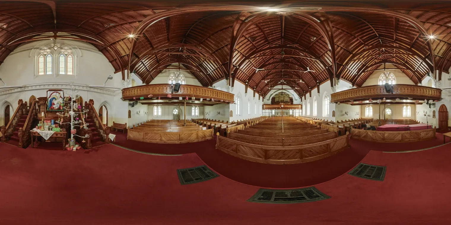
The way to replicate that in a 3D scene is to wrap the piece in a photograph of a real environment. Not a backdrop, not a background image, but a 360-degree photograph taken in a real space that the renderer can use as a light source from every direction at once. The piece then sits inside that environment the way a real object would, picking up colour casts from the walls, catching reflections of whatever would be around it, responding to the light the way something actually sitting in that space would respond.
For most products this is an improvement. For jewellery it’s the entire game. Gold is almost entirely defined by what it reflects. A diamond is almost entirely defined by what passes through it and bounces back. A piece of jewellery sitting under flat, artificial lighting looks like a prop. The same piece wrapped in a real light environment looks like it belongs to a physical world, which is the first thing a render needs to do before a customer can start to feel anything about it.
There’s a practical upside to this approach as well. A real light environment captured as a photograph is, computationally, a single image the renderer reads once. Multiple point lights each require their own calculations across every surface in the scene, every frame. The photography approach is not only more realistic, it’s significantly less demanding on the hardware doing the work, which matters when the goal is something that runs smoothly on a phone.
The Perfection Paradox
The standard advice for making CGI look real is to add imperfection. Scratches, fingerprints, smudges, micro-variation in the surface. The logic is sound: real objects accumulate history, and a surface with no history looks artificial. For most products this is correct. A render of a car that looks freshly minted reads as fake. A render of a leather bag with no wear on the edges looks like a toy.
Jewellery inverts this completely.
A well-made ring fresh from a jeweller’s hands is as close to perfect as human craft gets. The finish is intentional, consistent, and exact. The stone is selected for having as few natural imperfections and inclusions as possible. The whole point of the piece, a significant part of what someone is paying for, is that level of refinement. Adding artificial surface variation to a jewellery render doesn’t make it look more real. It makes it look like a used piece, and a customer looking at something they’re supposed to fall in love with is not helped by being reminded that objects accumulate wear.
This took some trial and error to learn. Adding noise to the surface properties to break up the uniformity is a standard technique that works almost everywhere else. Applied to a gold band it produced a result that looked dull and visibly tiled in a way that nothing about real gold ever does. Pulling it back out and letting the surface be what it actually is, polished and consistent and nearly perfect, made the render look significantly more convincing. The realism of a fine piece of jewellery is its perfection. Honoring that is what accuracy actually looks like here.
What Makes a Stone Look Alive
If you’ve read the previous article, you’ll already know why gems are the hardest part of the problem. Light doesn’t just bounce off a stone the way it bounces off a gold band. It enters the stone, bends as it crosses into the material, travels through the interior, bounces off internal faces, bends again, and exits from a completely different point than it entered. The fire inside a well-cut diamond, those shifts of colour and light as the stone moves, comes from that entire process happening across hundreds of facets at once. Simulating it accurately is the kind of work that takes seconds per frame on a powerful desktop machine.
Real-time rendering on a phone can’t do that. What it can do is follow the light one step into the stone: enter, bend, bounce once, exit. That single step is the difference between a gem that looks like a coloured piece of glass sitting on top of a ring and one that seems to have actual depth and life to it. It doesn’t fully reproduce the fire of a real stone under boutique lighting, and if you know what you’re looking for you can tell. But the presence of even that one internal bounce changes the read of the stone dramatically. Without it a gem is flat and decorative. With it, something inside it catches the light and moves as you turn the piece, and that movement is what the eye is actually looking for.
The practical ceiling for real-time gem rendering is that single bounce. Going beyond it on a phone isn’t currently viable without the render slowing to the point where the interactivity that makes the whole thing worthwhile disappears. So the question becomes how much that one bounce can do, and the answer, in practice, is considerably more than you’d expect before you’ve seen it. A stone with one bounce feels present in a way that a stone with none simply doesn’t, and for a customer who’s never seen a gem rendered either way, the one-bounce version is convincing enough that imagination carries the rest.
The Honest Gap
Everything in the previous three sections is about getting a real-time render as close to convincing as the constraints allow. It’s worth being equally clear about where those constraints sit and what they actually cost, because the gap between a real-time render and a fully unconstrained one is significant, and a client who discovers it later is in a worse position than one who understood it from the start.
Both approaches, real-time and the kind of careful, unhurried rendering a 3D software package does when given unlimited time, are doing versions of the same math. The difference is purely in how long they have to do it. A real-time render has 16.67 milliseconds per frame, roughly one sixtieth of a second, before the next frame has to be ready. A proper offline render of the same scene, using the same piece, the same light environment, the same materials, takes somewhere between 9 and 15 seconds to produce a single frame. That’s not a rounding difference. It’s roughly 500 to 900 times more processing time per picture.
What fits into those two budgets looks different. With that much time available, an offline renderer can trace light through a gem not once but four, five, six times or more, following each bounce through the interior until the contribution becomes too small to matter. The result is the kind of gem that looks genuinely alive: the fire is there, the internal complexity is there, the colour splits across the facets the way they do in reality. Rendered this way and given enough bounces, the gap between the image and a photograph of the real piece narrows considerably. Running the same settings on anything short of a gaming desktop collapses the frame rate immediately. Even a high-end laptop struggles above a single bounce.

The real-time version with one bounce is a genuinely good result. It’s good enough that most customers looking at it will feel something, which is the bar the client conversation at the start of this article set. But it is a different result, and the difference is visible if you’re looking for it. Naming that honestly is more useful than pretending the line doesn’t exist.
Close Enough to Feel Something
There’s a version of this problem that sounds like it has a straightforward solution: just make the render more realistic. Better light, more bounces, higher resolution, more time. Get it close enough to a photograph and the feeling follows automatically.
It doesn’t quite work that way. Think about the films or video games you remember as visually stunning from ten or fifteen years ago. Go back and look at them now and the technical execution often looks noticeably rougher than memory suggested. The geometry is simpler. The lighting is flatter. The detail that felt present in your recollection isn’t quite there in the frames. But the emotional experience was real. The feeling was real. Memory preserved the response, not the resolution.
Something similar is at work when a customer looks at a render of a piece they’re already leaning toward wanting. They are not conducting a technical inspection. They are looking for permission to feel what they’re already starting to feel. A render that gets close enough hands them that permission. One that obviously doesn’t get close enough breaks the spell before it has a chance to form.
The client observation that opened this article was that customers arrive having already done their research. They know what they want. What they need is to feel it. The render’s job in that moment is not to be a perfect reproduction of the physical piece. It’s to be close enough that imagination can carry it across the line, and imagination, in a customer who’s already interested, is a remarkably generous collaborator.
Getting the light right, respecting the perfection of the piece, coaxing the stone to life within the constraints of what a phone can actually do in real time: none of that produces a flawless photorealistic simulation. Together they produce something that earns the feeling. That’s the standard everything in this article is aimed at, and in practice it’s a more useful one than chasing a benchmark that even boutique photography doesn’t always clear.